Product Shots
Deirdre Brennan

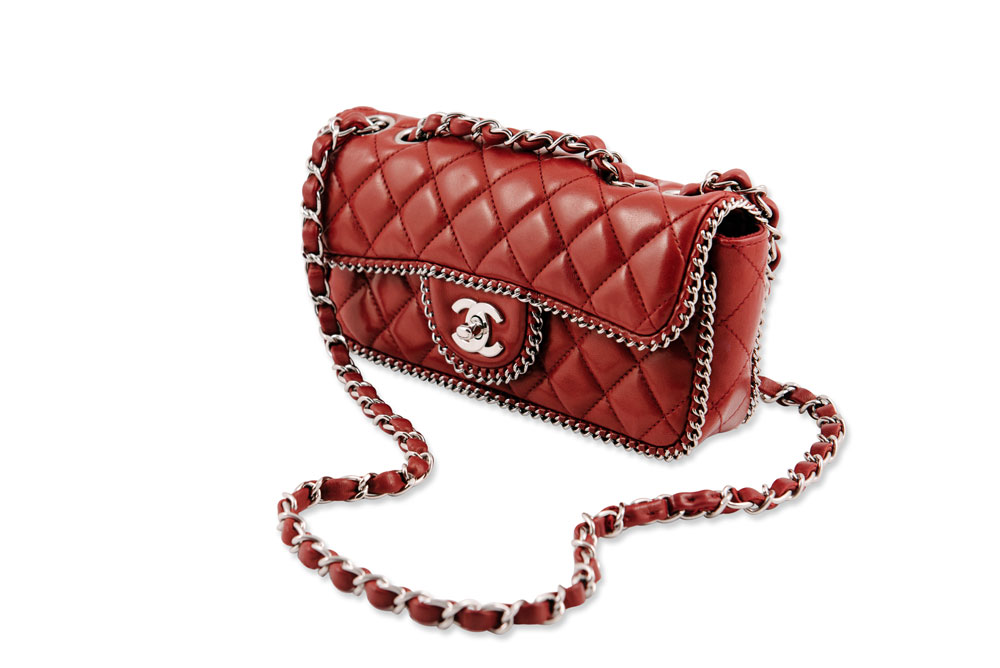
The photographer took this photo very well because you can see how clear the line patterns of the bag and while you're looking at it, you can already feel the texture of the product. The photographer probably used a large source of light when taking this image because you could barely see any shadows as the light reflects equally on each sides.
Joshua Buhrnmann

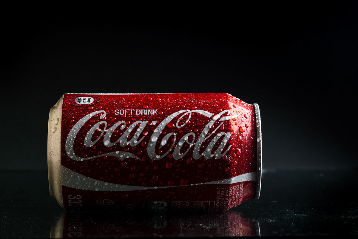
I choose this photo because it reminds of our last photography lab when we have bring an object. One of the object was a can and it was hard to experiment with the lighting because it was white the same as our background. This photo really displays the product really well and adding water to it shows a huge difference. Using a dark or black background also helps the Coca Cola product stand out perfectly because of the color combination between red and black. They also used a glassy surface to reveal the shadow creating more suitable effects.
Carlton Photography

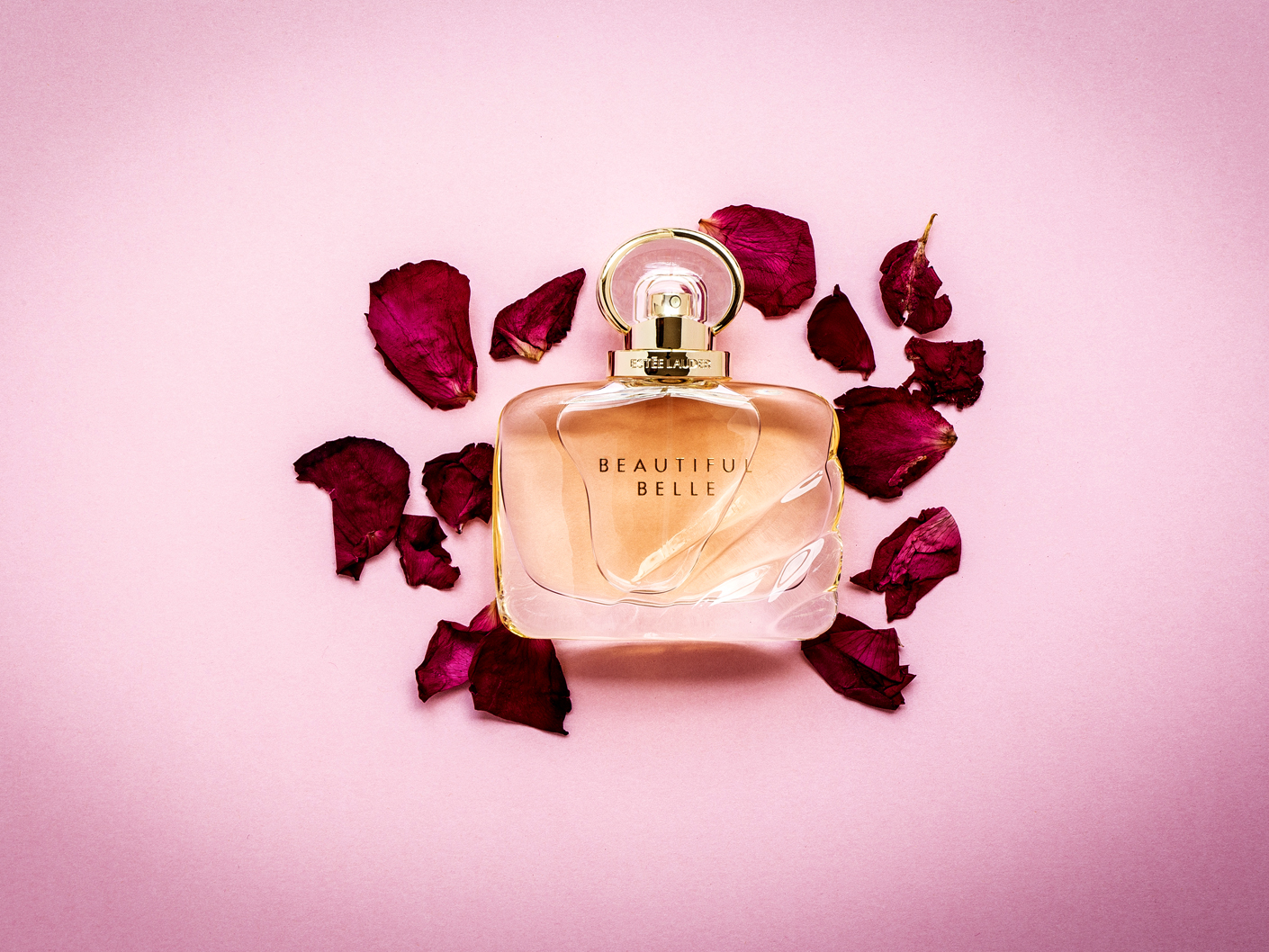
This time, the background color is pretty similar to the product. I admire how they use contrasting shade of pink and still did not overdue it. The rose petals also gives a fresh and sweet feeling in this photo. I think one of the main light (family of angles) are facing on the upper part of the product and gives a small reflection at the bottom of the perfume. I also think that they used a polarizing filter on the camera because the reflection of liquid is eliminated making the brand name stands out clearly.
No comments:
Post a Comment