Friday, April 17, 2020

Product shots at home III


Shoes

Today I will be experimenting more on bigger object such as shoes. I want to have many tryout as much as I can before deciding what I really want to do for my main product shot.


Image 1

Image 2


I find it difficult to remove the object that i used to stand the shoe. I also remove the light reflecting on the logo in the first image. 

Image 3

The set up that i used to get take the photos is, I put and object were i can place the shoe in this position and i faced the object in front of the main light and use my other phone flashlight (covered with white tissue to soften the light) and the background is white and has a light gradient effect when i use flash.


Here are the photo before:

Image 1

Image 2

Image 3


Friday, April 10, 2020

DIY Product Shots at home II


Acrylic Paint and a Brush


The lighting is facing the object (front) and I also use my phone flash to capture this image.


Watches


This is my favorite image that I took today because the image of the watch is in detail and also the lighting turned out really good. I used my other phone's flashlight and the key light is facing the object so the shadow move to the back. I also bough some reflective silver paper and i paint an A4 sheet to black because i don'd have any black page. 


This image did not really turn out well because of the adjustments in my phone camera while I was trying to experiment. however, i like the little reflection of the light. 


I also tried different types of white balance (on the right) and  think it enhanced the color of the watch more.


Jewelries


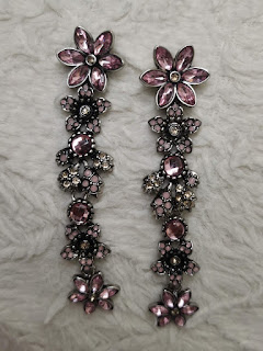
Taking photos of jewelries are very challenging because they are small objects and capturing them by itself can look simple and boring. the light should also be more closer  to it to give more brightness. Using a phone without a tripod can be challenging because the more you zoom in the more the lens shake as your are only holding the phone.


I also tried to use my pillow to add some texture in the image and to make the earrings stand out. I also tried to take a photo of rings but I think they didn't really turn out well as some of the rings are not on focus so i decided that i won't be choosing rings for my main product shot.


Thursday, March 26, 2020

DIY Product Shots at home

Glass Object


The first object that I decided to take a picture of, is a perfume. I find it difficult to take shots of because the shape of the object is triangular therefore it's challenging to show the brand name clearly. I also use a sheet of paper to cover the lamp so it won't show too much light at the background. 


I did not use any flash at the images above as well because i was trying to control the brightness of the camera.


I also used a glass from the frame i have to show the reflection of the object but i wish i had a bigger glass so that it wont show at the main image. The next image on the left side was taken with my phone flash only and a light coming from the right side (covered).


I also tried to take the object outdoors to see the difference between the indoor set up lighting and I really like how it turned out because it looks clearer and the brightness are more natural.


I also tried a different reflective object and the light was placed in front of the object. The second product is a bit easier to capture because its black and it contrast to the white background that I used. In the second image I tried to experiment with the white balance option on m phone camera and the light is placed at the right side. I like the effects that it gives to the sunglasses as it gives more tone and the photo doesn't look plain and dull.


Metal Objects


For the metal object, I picked whisk to experiment. The metal object looks plain against the white background so i also decided to mess around with the white balance again and the ISO settings and shutter speed. 


All this images was taken with the lighting placed on the left side and used different levels of white balance. The last images stands out for me because the effects gives colors and depth to the object.


Thursday, March 19, 2020

Product Shot Proposal

Product Proposal


 1. Who is the client, or company you are representing?

My main client for this product advertisement is women who like fashion and wearing jewelries. The company of the watch that I will be representing is Versace a well-known Italian company. They are also popular for having a symbolic print and bright colors with style and for its contemporary designs.


 2. What is the product?

I decided to take a photo of a Versace metallic mini vanity watch for my chosen product from the company. I choose this product because it looks simply, and it has that sophisticated effect. The design pattern of the product is very refined and gives elegance to it. They also use the logo to represent the 12 number which make it more visible to the eye of the consumer and they also insert the country where the product was made across the logo and name. 


 3. Who is the target audience?

My target audience are women between the age of 18-50. In this generation, most teenagers like to wear branded products and will spend a lot of money just to look more like an adult, while adults like wearing jewelries such as watches as they want to look more professional and it really adds to their fashion styles.


 4. Where would you expect to see this advertisement?

I expect to see this advertisement anywhere online such as in social media applications and in the main website of the product. This advertisement can also be found in brochures or fashion magazines and can be advertised in different places such as at the airport duty free section and shops around the city center e.g. Brown Thomas.


 5. What kind of lighting are you going to use to make this look professional?

To make the product image look more professional I will have a white background and I will be focusing on the middle part of the watch where the important part is located such as its brand symbol, name the time and product design.  I will also use a bright fluorescent light because it gives a white and clear lighting for my product rather than using an incandescent lighting which will provide a yellow effect on the image that will make the image not as good as I want to. I am aiming to have a white and clear background. I also use some plain and reflective paper to give effects and better lighting.

I also did some research about how to take shots of watches:

https://www.fratellowatches.com/10-tips-for-better-watch-photography/


 6. What props do you need?

The props that I will use is an A3 white paper for the field and background. a reflective silver paper that I purchased to create mirror effect shadow of the product.


Wednesday, March 18, 2020

Product Shots Research

Product Shots


Deirdre Brennan 

         Product-Photographer-in-Dublin

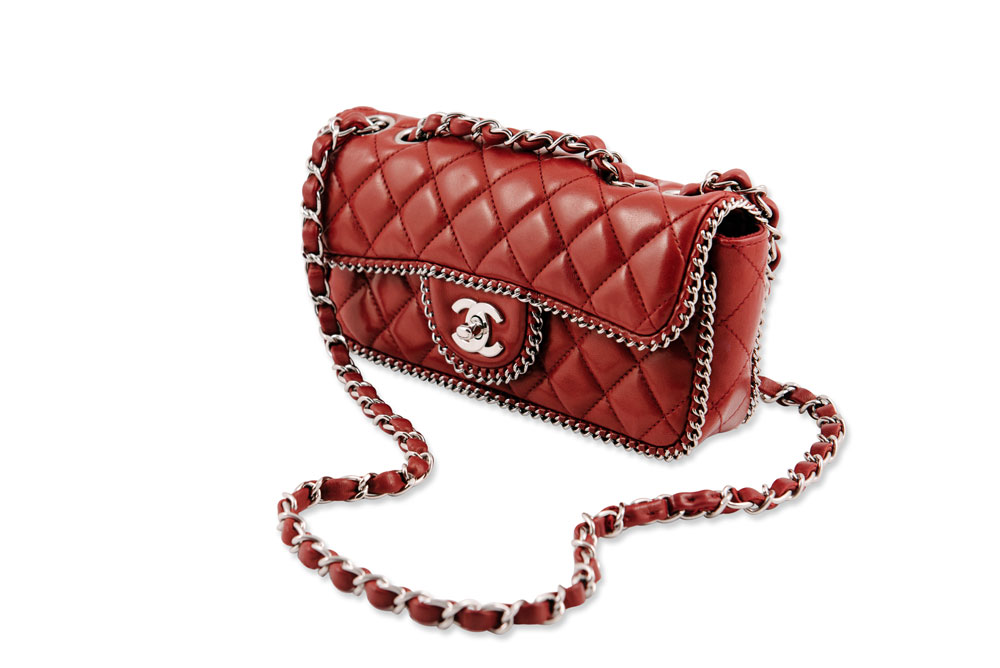
The photographer took this photo very well because you can see how clear the line patterns of the bag and while you're looking at it, you can already feel the texture of the product. The photographer probably used a large source of light when taking this image because you could barely see any shadows as the light reflects equally on each sides.


Joshua Buhrnmann 


Image result for product photography


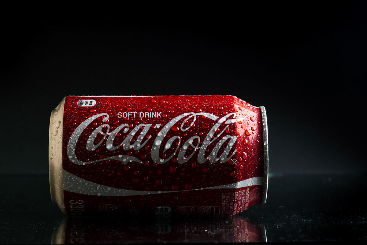
I choose this photo because it reminds of our last photography lab when we have bring an object. One of the object was a can and it was hard to experiment with the lighting because it was white the same as our background. This photo really displays the product really well and adding water to it shows a huge difference. Using a dark or black background also helps the Coca Cola product stand out perfectly because of the color combination between red and black. They also used a glassy surface to reveal the shadow creating more suitable effects.


Carlton Photography


Image result for product photography perfume


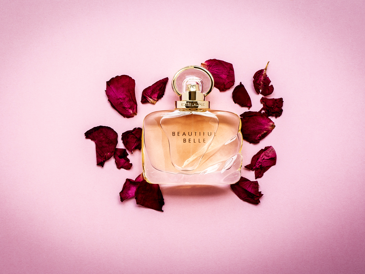
This time, the background color is pretty similar to the product. I admire how they use contrasting shade of pink and still did not overdue it. The rose petals also gives a fresh and sweet feeling in this photo. I think one of the main light (family of angles) are facing on the upper part of the product and gives a small reflection at the bottom of the perfume. I also think that they used a polarizing filter on the camera because the reflection of liquid is eliminated making the brand name stands out clearly.


Tuesday, March 3, 2020

Portrait Photography


Portrait Photography

photos 

by best portrait photographers

By: David Lazar

Comfort
Refreshing
Innocence 
Natural
Native

Nostalgic
Free 
Happy
Calm
Relaxed

Unique
Intense
Traditional
Captivating
Attracting

Fresh
Pleasing
Passionate
Authentic
Realistic

Fearless
Cool
Pure
Vividness
Distinctness